

Learn 20 practical landing page optimization strategies to improve clarity, user experience, trust, performance, and conversions.
A landing page has one important job: move a visitor toward a specific action.
That action could be submitting a form, requesting a quote, booking a consultation, purchasing a product, downloading a resource, or contacting your business.
However, many landing pages make visitors work too hard to understand what the business offers or what they should do next.
A better landing page combines clear messaging, strong visual hierarchy, persuasive content, trust signals, fast performance, and a focused call-to-action.
In this guide, we'll look at practical changes that can make a landing page clearer, more engaging, and more effective at converting visitors.
What Makes a Good Landing Page?
A landing page should answer three questions almost immediately:
What are you offering?
Why should I care?
What should I do next?
If visitors have to scroll through multiple sections before understanding the offer, there is a good chance the page is creating unnecessary friction.
A strong landing page usually has:
- A clear headline
- Supporting message
- Strong visual hierarchy
- One primary conversion goal
- Relevant imagery
- Benefits-focused content
- Social proof
- Trust signals
- Clear CTA
- Mobile-friendly design
- Fast loading performance
The goal isn't to fill the page with more content.
The goal is to make the right information easier to understand and act on.
1. Make the Main Message Immediately Clear
Your headline is often the first piece of content visitors notice.
Avoid vague statements such as:
“We Build Better Futures.”
It sounds positive, but it doesn't explain what the business actually does.
A stronger version would be:
“Custom Websites That Help Australian Businesses Generate More Leads.”
Now the visitor understands:
- What you provide
- Who it is for
- What outcome they can expect
Your headline doesn't need to explain everything.
It simply needs to make the value proposition clear enough for the visitor to continue.
2. Give the Headline a Strong Supporting Message
The headline gets attention, but the supporting text should provide context.
For example:
Headline:
“Get a Faster, More Effective Website for Your Business.”
Supporting text:
“We design and develop custom websites that are fast, mobile-friendly, easy to manage, and built around your business goals.”
This combination gives visitors a much better understanding of the offer.
3. Put the Primary CTA Where Visitors Can See It
A call-to-action should not be hidden at the bottom of the page.
If the goal is generating leads, the first screen might include:
Get a Free Quote
Book a Consultation
Request a Callback
Start Your Project
The exact CTA should match the action you want visitors to take.
Avoid using multiple competing primary CTAs.
For example, showing:
Buy Now + Learn More + Contact Us + Download + Book Now
can make the page feel unfocused.
Choose one primary action and make it visually obvious.
4. Focus on Benefits Instead of Only Features
One of the easiest ways to improve landing-page copy is to move from features to outcomes.
For example:
Feature:
“Custom WordPress Development”
Benefit:
“Get a website built specifically around your business instead of being limited by a generic template.”
Another example:
Feature:
“24/7 Monitoring”
Benefit:
“Know when something goes wrong before it becomes a bigger problem.”
Features explain what you provide.
Benefits explain why the visitor should care.
5. Reduce Unnecessary Content
More content doesn't automatically make a landing page better.
If a page contains:
- Five long paragraphs
- Multiple navigation options
- Repeated information
- Unnecessary animations
- Several competing CTAs
- Large blocks of text
the visitor may struggle to identify the important information.
Review every section and ask:
Does this help the visitor understand the offer or make a decision?
If the answer is no, consider removing it.
6. Create a Strong Visual Hierarchy
Visitors don't read every landing page word-for-word.
They scan.
Your design should therefore make the important information easy to find.
Use visual hierarchy to distinguish:
Primary message
↓
Supporting information
↓
Benefits
↓
Proof
↓
CTA
Important elements can be emphasized through:
- Typography
- Spacing
- Section positioning
- Contrast
- Buttons
- Icons
- Images
- Cards
Good design isn't about making every element stand out.
It's about making the right element stand out.
7. Use a Simple Conversion Journey
A landing page should guide visitors toward a decision instead of presenting disconnected sections.
A useful structure can look like this:
The numbers above are illustrative, not industry benchmarks.
The important idea is the journey:
Understand → Trust → Evaluate → Act
Your page should make that journey as easy as possible.
8. Add Social Proof
Visitors may not immediately trust a business they've never used before.
Testimonials can reduce that uncertainty.
Good testimonials are specific.
Instead of:
“Great company. Highly recommended!”
A stronger testimonial explains the result:
“The new website made it much easier for customers to understand our services, and we started receiving more enquiries through the site.”
Where appropriate, include:
- Customer name
- Company
- Photo
- Review
- Project
- Specific result
Real proof is much more persuasive than generic marketing statements.
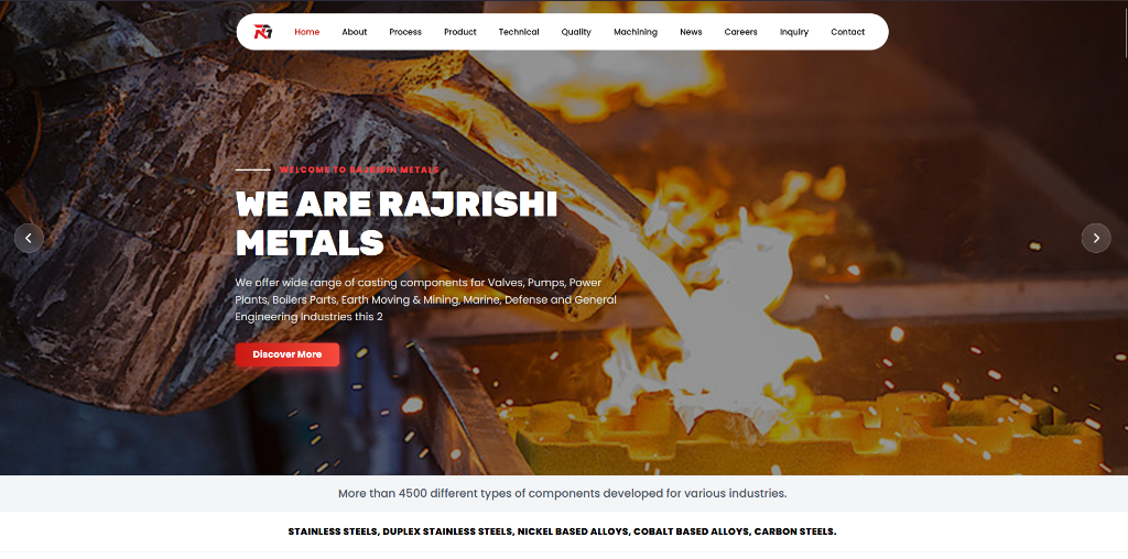
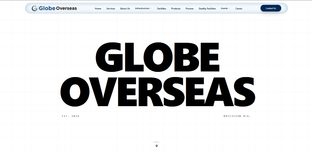
9. Show Your Work
If you're selling a service, don't just tell visitors you're good.
Show them.
For a web development agency, this could include:
- Recent websites
- Before-and-after redesigns
- Ecommerce projects
- Case studies
- Client industries
- Screenshots
- Performance improvements
- Testimonials
A portfolio section can help visitors visualize what they could receive.
10. Use Better Images
Images should support the message.
Avoid adding stock photos simply because a section looks empty.
For example, a professional services landing page might benefit from:
- Product screenshots
- Real team photography
- Project images
- Before-and-after comparisons
- Product demonstrations
- Custom illustrations
The image should answer:
Why is this image here?
If it doesn't add information, emotion, credibility, or context, it may not be necessary.
11. Make the CTA Visually Obvious
A CTA should look clickable.
Instead of hiding an important link inside a paragraph, use a clear button.
Examples:
Get Your Free Quote
Book a Strategy Call
Start Your Project
Request Pricing
Keep the wording specific.
“Submit” tells the user very little.
“Get My Free Website Audit” communicates exactly what happens next.
12. Reduce Form Friction
If your landing page uses a form, don't ask for information you don't actually need.
A form with:
- Name
- Phone
- Company
- Website
- Industry
- Budget
- Address
- Message
- Company size
may discourage visitors.
Start with the information required to begin the conversation.
For example:
Name
Website
What do you need help with?
You can collect additional information later.
13. Make the Page Mobile-Friendly
A landing page can look excellent on a desktop and still provide a poor experience on mobile.
Check:
- Font sizes
- Button sizes
- Spacing
- Image scaling
- Navigation
- Forms
- Videos
- Horizontal scrolling
- CTA visibility
Google recommends providing a good overall page experience across devices, and mobile presentation remains an important part of that experience.
Always test the actual mobile page rather than assuming a responsive design is working correctly.
14. Improve Page Speed
A beautiful page isn't useful if visitors leave before it finishes loading.
Review:
- Large images
- Video backgrounds
- Third-party scripts
- Tracking tools
- Fonts
- Animations
- Unused JavaScript
- Unnecessary plugins
- Hosting performance
Google recommends good Core Web Vitals for a strong user experience. Current Core Web Vitals include LCP, INP, and CLS, covering loading performance, responsiveness, and visual stability.
Speed improvements should focus on the real bottlenecks rather than trying to achieve a perfect score for its own sake.
15. Avoid Intrusive Popups
Popups can sometimes help conversions, but they can also interrupt visitors.
Avoid immediately covering the entire page with:
- Newsletter forms
- Promotional messages
- App downloads
- Large advertisements
- Multiple competing offers
Google specifically recommends avoiding intrusive interstitials that make content difficult to access.
If you use a popup, make sure it has a clear purpose and doesn't prevent visitors from accessing the main content.
16. Match the Landing Page to the Ad
If someone clicks an advertisement promising:
“Get a Free Website Audit”
they shouldn't arrive on a generic homepage that says:
“Welcome to Our Digital Agency.”
The landing page should continue the same message.
The visitor should immediately recognize:
I clicked the right thing.
This creates consistency between:
Ad → Landing Page → Offer → CTA
For paid campaigns, this can be particularly important because sending visitors to a generic page can create unnecessary friction.
17. Build Trust Before Asking for the Sale
People are more likely to take action when they feel confident about the business.
Trust signals can include:
- Client logos
- Testimonials
- Case studies
- Reviews
- Certifications
- Awards
- Guarantees
- Secure payment information
- Contact details
- Business information
- Industry experience
Don't place every trust element in one section.
Distribute relevant proof throughout the page so visitors encounter reassurance as they evaluate the offer.
18. Answer Objections Before They Become Problems
Visitors often have questions before taking action.
For example:
“How much does it cost?”
“How long will it take?”
“Can I cancel?”
“Do you work with businesses like mine?”
“What happens after I submit the form?”
A good landing page anticipates these concerns.
Add an FAQ or short reassurance sections where appropriate.
The objective is to remove uncertainty.
19. Keep Navigation Focused
A landing page doesn't always need the same navigation as your main website.
If the page exists specifically to generate leads from an advertising campaign, too many navigation options can distract visitors from the main objective.
Consider whether visitors actually need links to:
- Every service
- Every blog post
- Every company page
- Multiple external platforms
The answer depends on the purpose of the landing page.
The goal should always be to provide enough information to make a decision without creating unnecessary distractions.
20. Test Different Versions
You don't have to guess which landing page works best.
Test variations.
For example:
Version A
“Build a Website That Grows Your Business”
Version B
“Get a High-Performance Website Built for Your Business”
You can also test:
- CTA wording
- Hero image
- Form length
- Headline
- Testimonials
- Pricing presentation
- Section order
- Button placement
Measure the results rather than relying purely on personal preference.
A High-Converting Landing Page Structure
A practical landing page could follow this structure:
Section 1 — Hero
Clear headline + supporting statement + primary CTA
↓
Section 2 — Problem
Explain the problem the visitor is experiencing.
↓
Section 3 — Solution
Show how your product or service solves it.
↓
Section 4 — Benefits
Explain the most important outcomes.
↓
Section 5 — Proof
Testimonials, case studies, reviews, results.
↓
Section 6 — How It Works
Show the process in three or four simple steps.
↓
Section 7 — FAQ
Remove common objections.
↓
Section 8 — Final CTA
Give visitors one clear next step.
Landing Page Optimization Checklist
Use this checklist when reviewing an existing landing page:
- Is the main offer immediately clear?
- Does the headline explain the value?
- Is there one primary CTA?
- Is the CTA visible without excessive scrolling?
- Are benefits clearly explained?
- Is unnecessary content removed?
- Is the visual hierarchy easy to follow?
- Are testimonials included?
- Is relevant proof displayed?
- Are objections answered?
- Is the form simple?
- Does the page work well on mobile?
- Are images optimized?
- Is the page fast?
- Are intrusive popups avoided?
- Does the landing page match the advertisement?
- Is the page secure?
- Are important links easy to find?
- Is the final CTA clear?
- Are conversions being measured?
Final Thoughts
A landing page doesn't need to be complicated to perform well.
The most effective pages usually make the visitor's decision easier.
Start with a clear message, explain the value, demonstrate credibility, remove unnecessary friction, and give visitors an obvious next step.
Then improve the experience through faster loading, mobile optimization, better content, stronger proof, and continuous testing.
Google's current guidance also reinforces the importance of useful, people-first content and a strong overall page experience rather than optimizing for a single isolated ranking signal.
The basic formula is simple:
Clear Message → Strong Value → Trust → Low Friction → Clear CTA → Better Experience
A landing page should not simply look good.
It should make it easier for the right visitor to say yes.
Landing Page FAQ
How long should a landing page be?
There is no universal ideal length. The page should be long enough to answer the visitor's questions and overcome objections, but not padded with unnecessary content.
How many CTAs should a landing page have?
You can repeat the same primary CTA at useful points throughout the page. The important thing is to avoid presenting several competing actions.
Does landing page design affect SEO?
Design itself isn't a shortcut to rankings. However, usability, mobile presentation, performance, accessibility, crawlability, and useful content all contribute to a better overall page experience.
Should I use a popup on my landing page?
Only if it provides genuine value and doesn't interfere with the main content or conversion path.
What is the most important landing page improvement?
Start with the message. If visitors don't immediately understand what you're offering, who it's for, and what they should do next, improvements elsewhere will have limited impact.
Key Takeaways
- 1Make your landing page message clear from the first screen.
- 2Use one primary CTA to guide visitors toward action.
- 3Focus your content on benefits, not only features.
- 4Build trust with testimonials, case studies, and relevant proof.
- 5Improve mobile experience, page speed, and form usability.
- 6Test different page elements and use real results to guide improvements.
Ready to optimize your platform?
Collaborate with our senior engineering & design team.


